On Air Now
Relaxing Evenings with Zeb Soanes 7pm - 10pm
20 October 2021, 17:08 | Updated: 20 October 2021, 21:38

Hugh Jackman builds jigsaw of Sydney Opera House
The New South Wales government has published rejected designs for the Sydney Opera House, which opened 48 years ago to the public.
Sydney Opera House, which sits on the shores of Sydney Harbour, Australia, is one of the world’s most beloved arts institutions. Known for the distinctive sails which envelop its exterior, inside the venue plays host to some of the greatest musicians and important public events.
But the great opera house could have looked very different, had a different artist’s design been chosen.
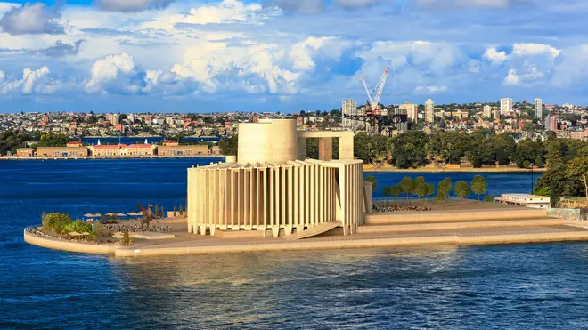
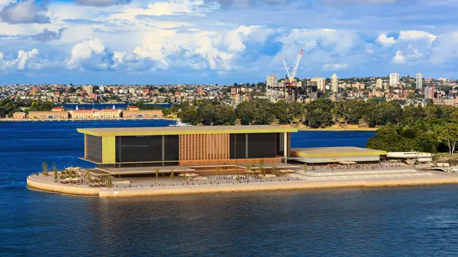
In celebration of 48 years to the day since the venue opened to the public, the New South Wales (NSW) Government shared images to Facebook, showing six of the 233 designs submitted in the mid 1950s.
Facebook users, many hailing from Sydney, have compared the rejected designs to “a power station”, “a trendy high school”, “a public hospital”, “an air filter”, and “IKEA”.
Read more: Nicole Kidman’s husband claims ‘violence at the opera’ as details of etiquette attack revealed

Danish architect Jørn Utzon won the international competition with his original design, which is shaped like the sails of a boat. Construction for Utzon’s design began on 1 March 1959 with a different designer, Peter Hall, in charge. The building was opened to the public 14 years later, on 20 October 1973.
The government’s Facebook post included six entries to the competition including one by disgraced English conductor Sir Eugene Goossens, who conducted the Sydney Symphony Orchestra and was the director of the NSW State Conservatorium of Music, but was forced to step down from both positions in 1956 after a public scandal.
Goossens’ design has been compared by Facebook users to both a power station and a “cigarette display”.

Other designers in the shortlist included Vine and Vine, SW Milburn and Partners, Paul Boissevain and Barbara Osmond, and Philadelphia collaborative group.
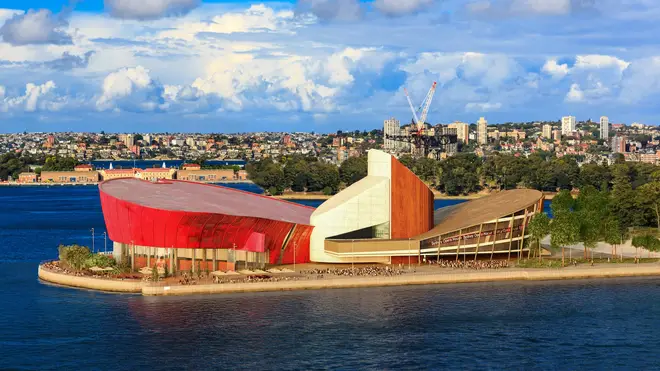
The one that came closest to beating Utzon’s iconic sails in the eyes of the public, was a design by László Peter Kollar and Balthazar Korab (see below), which incorporates wooden panels and a great red façade.
Read more: The history of Sydney Opera House in pictures

One user concluded that, in the end, she was “glad we went with the sails,” to which the NSW Government responded: “We agree!”
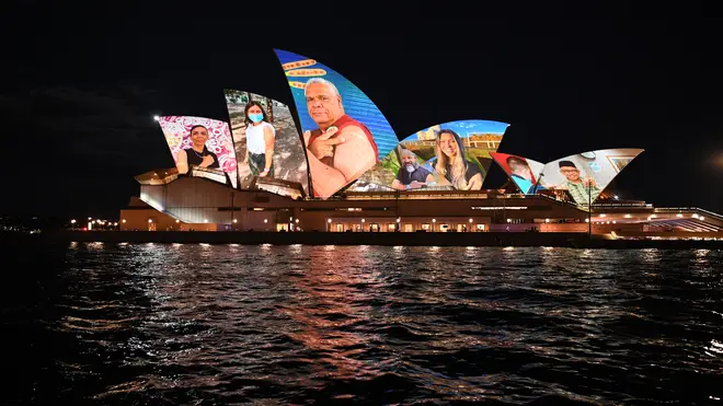
And here’s the great building in its full glory, its sails lit up in tribute to frontline workers as NSW reached its 80 percent vaccine milestone this week:
